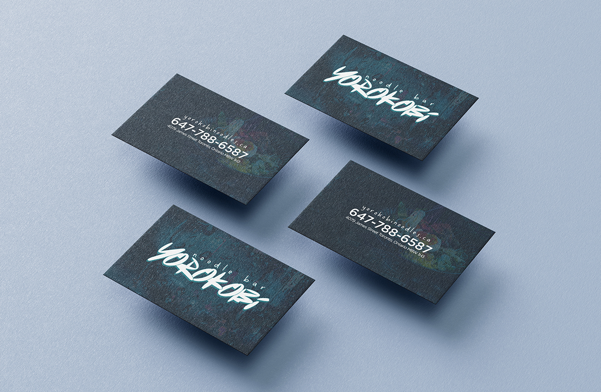
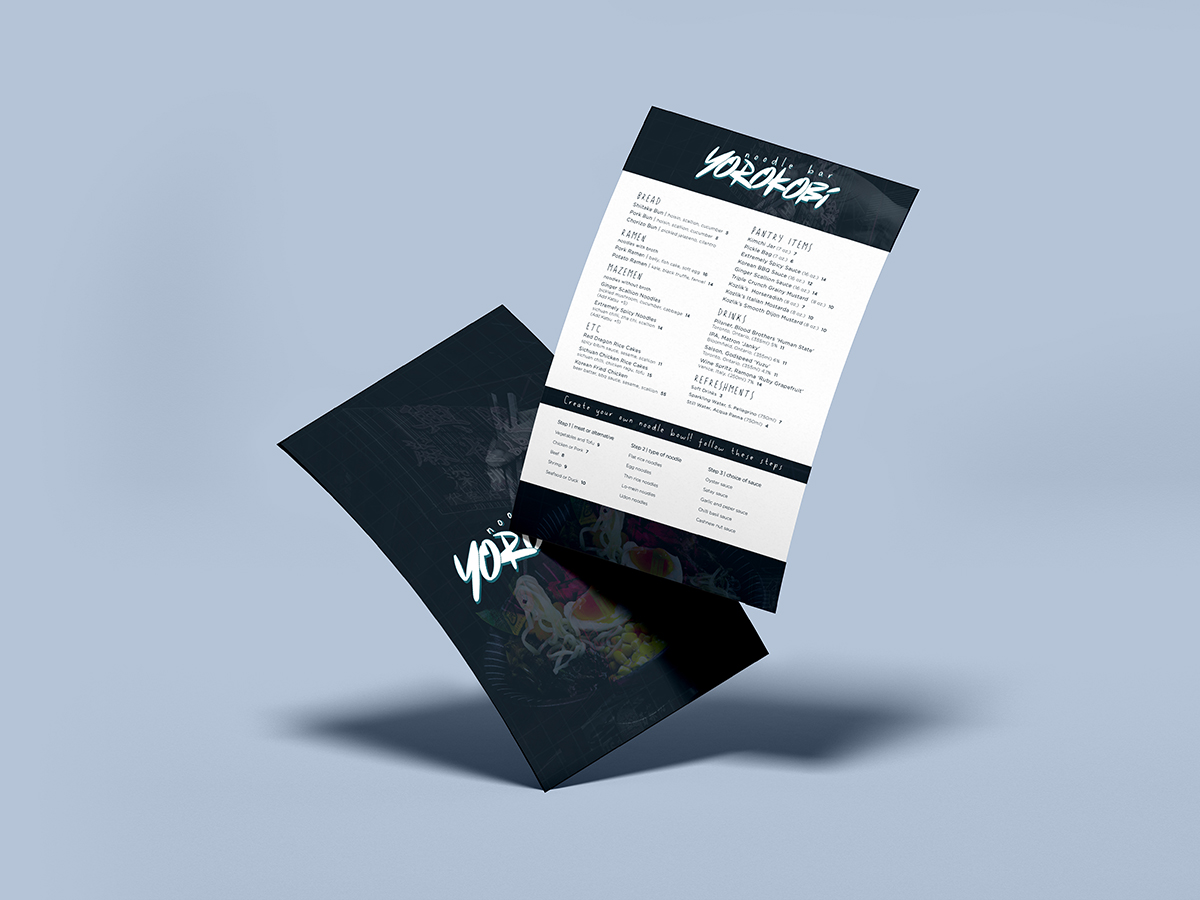
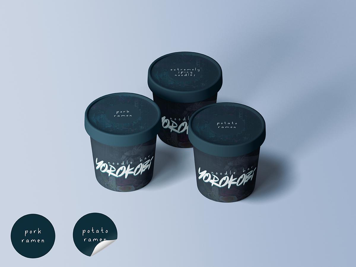
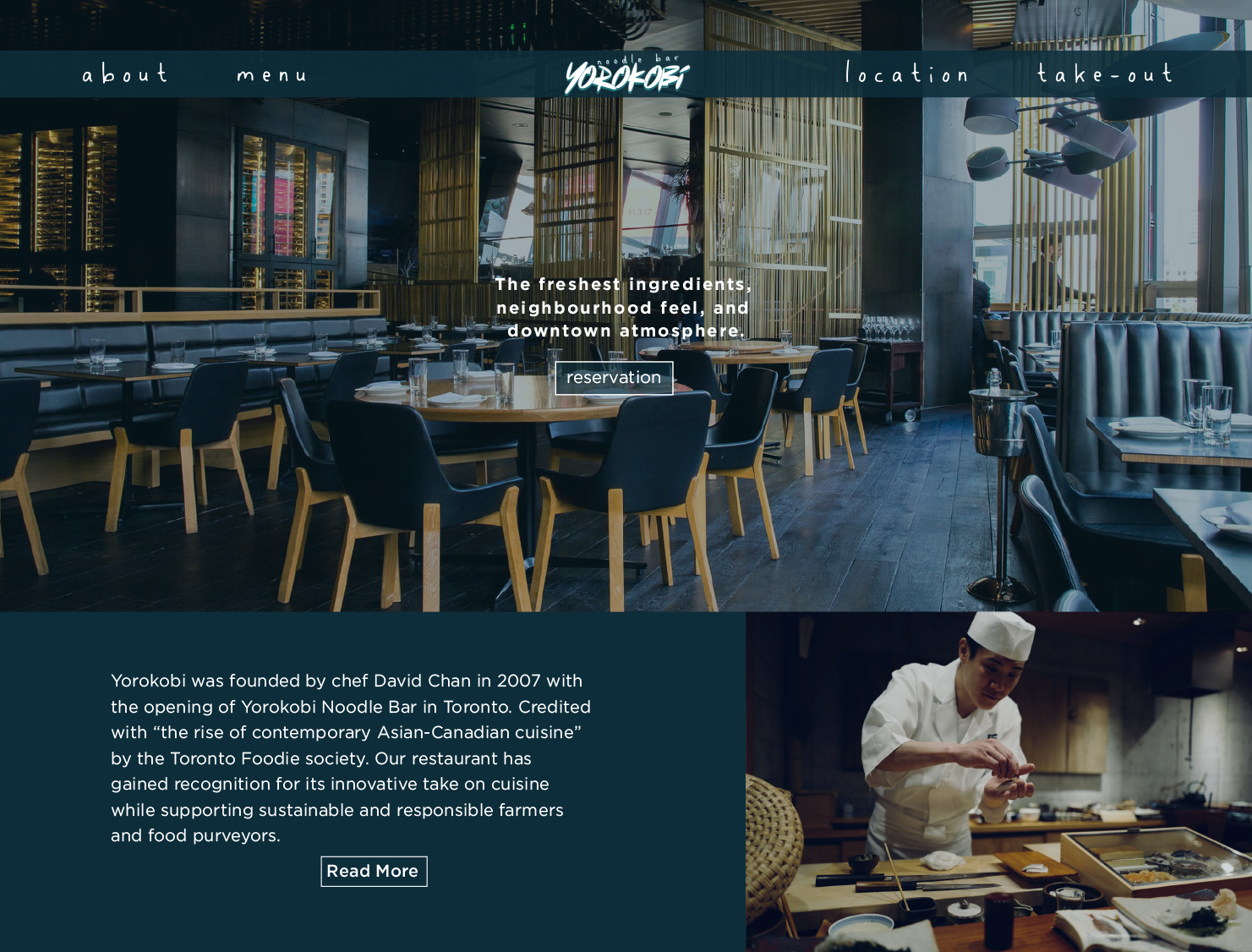
Yorokobi noodle bar
business card, menu, takeout containers, website
Yorokobi noodle bar was designed to give off an almost dual aesthetic. One being a cool hip lunch spot where the younger generations would come for the lunch rush. The subtle elements of neon signage and city nightlife calmed with a deep blue over tone. This was to tone down the restant to also appeal to the dinner reservation crowd. With hints of more prestige and elegance to the dining experience.