NYC Taxi
rebranding: logo, car wrap, app, billboard, bus ad
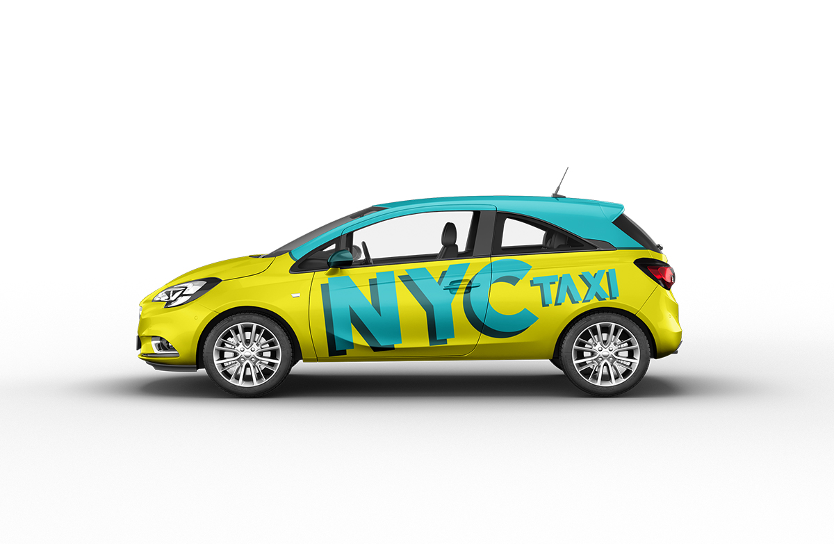
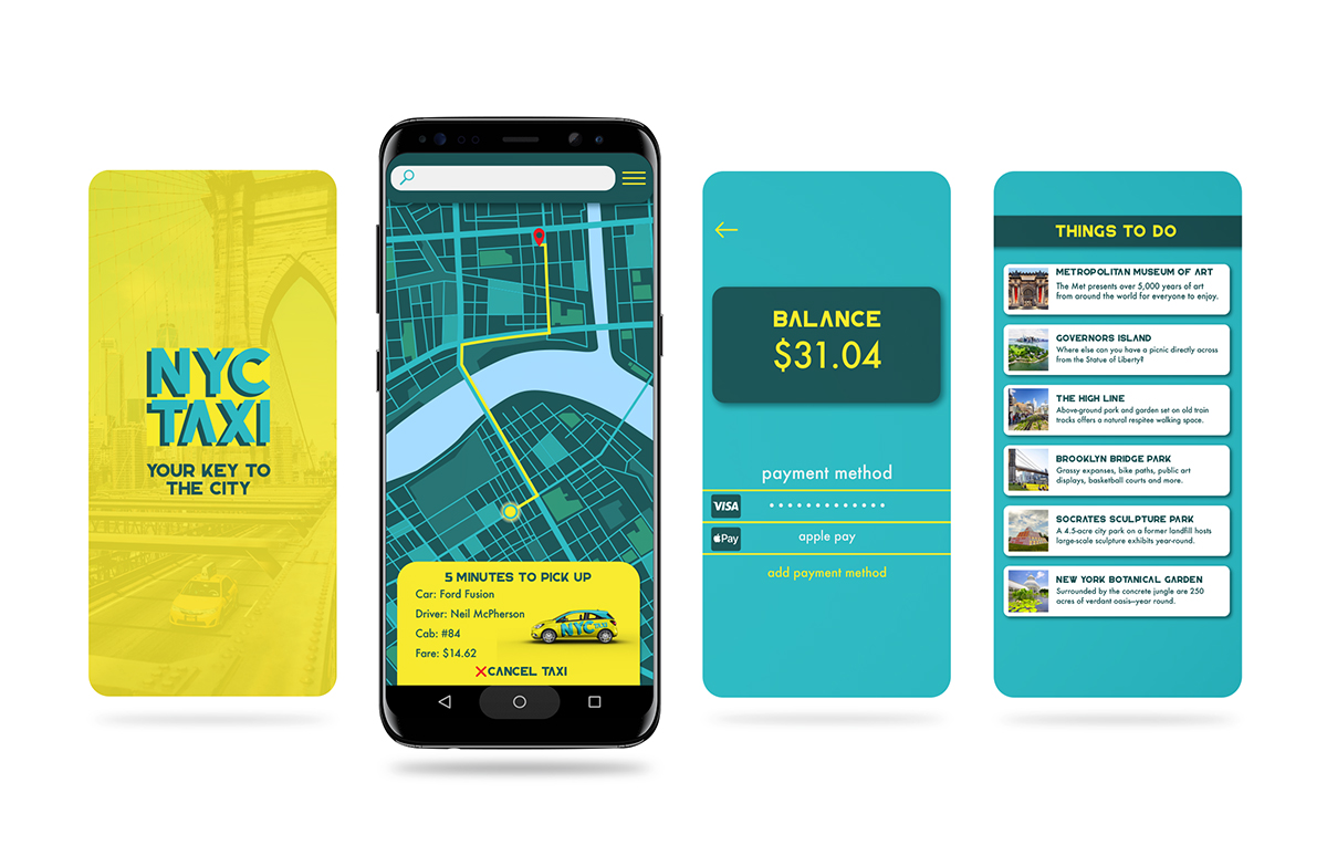
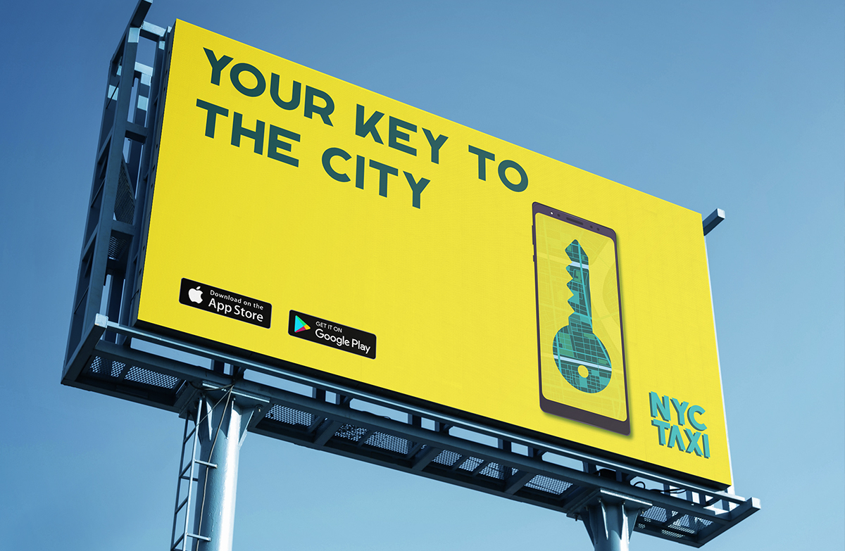
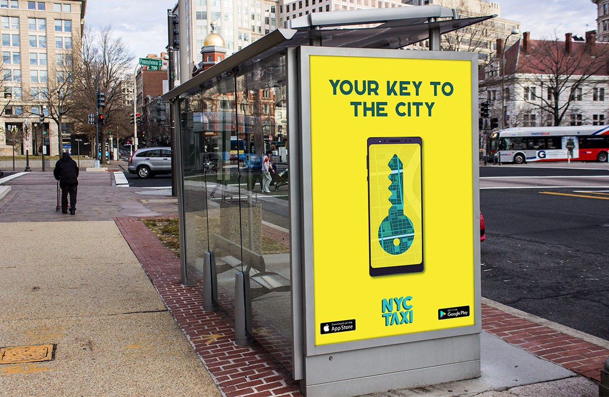
My main goal for the NYC Taxi rebranding was to give taxis a more personal feeling. Seeing the recent decline in taxi usage with the rise of rideshare brands like Uber I thought that taxis need that personal touch if they want to compete. In things like the taxi app design I added features like the drivers name, and the cabs number. Accompanied by a new striking colour scheme of yellow and blue. The yellow goes towards a more happy bright yellow over the more orange tone cars. Accompanied by large bold logos along the sides to add a fresh artistic feel. Tied together with a new slogan for NYC Taxi “your key to the city” playing that NYC taxi is the key to NYC, and the key to travelling the city. Overall a happier more personable experience for users to gain back more ridership to NYC Taxi!