Hail Kale
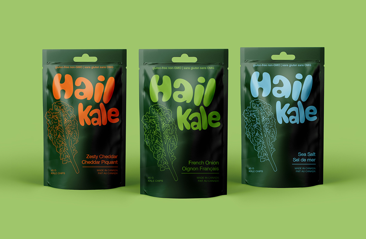
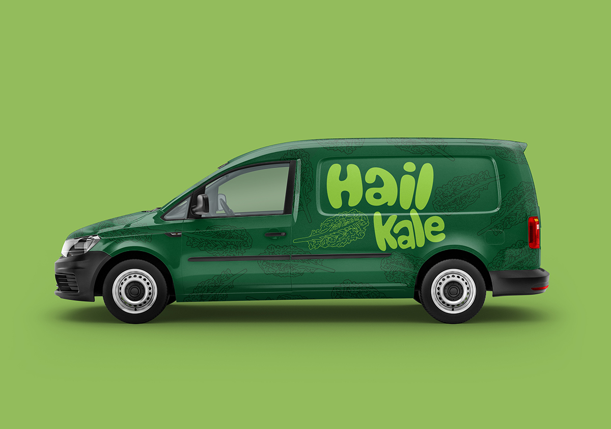
packaging family and delivery truck
Hail Kale was designed to give a real elegant yet playful look and feel. Using shapes to form the logo letters and each package only using 1 colour per flavour. This was to give the brand a great unified look on the shelf along with colour coding for flavours with ease of expansion to new flavours. The illustration of kale was made by me with reference from a piece of kale then hand drawn line-art.

